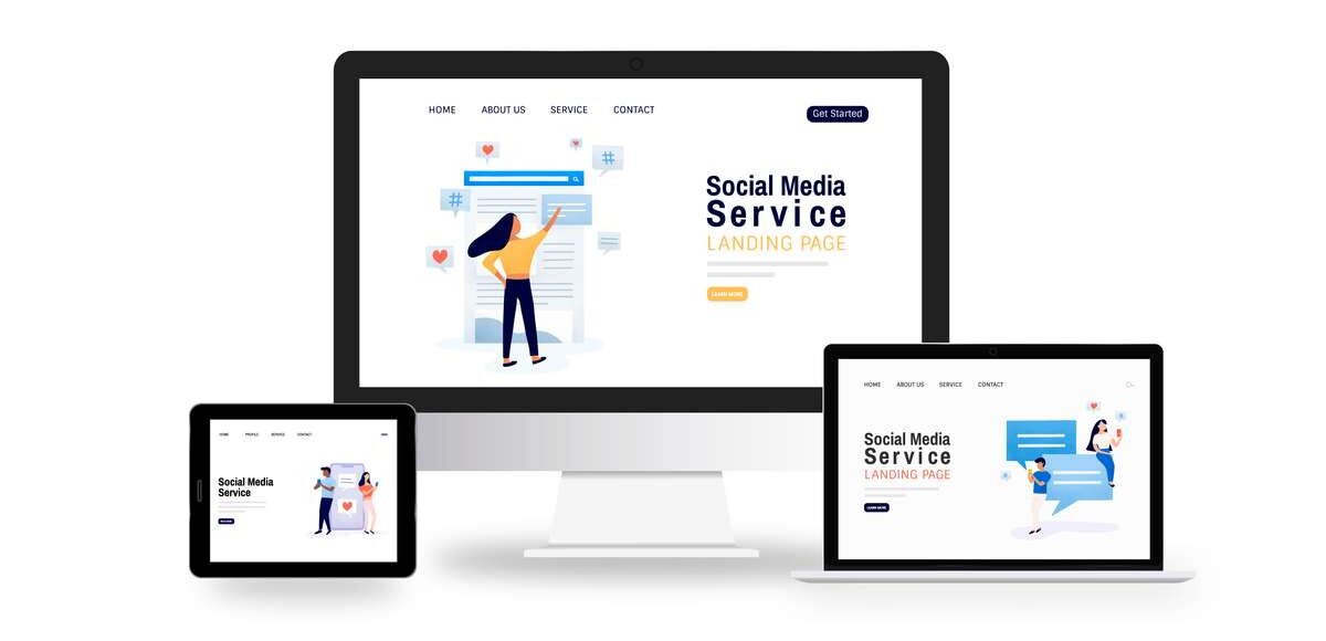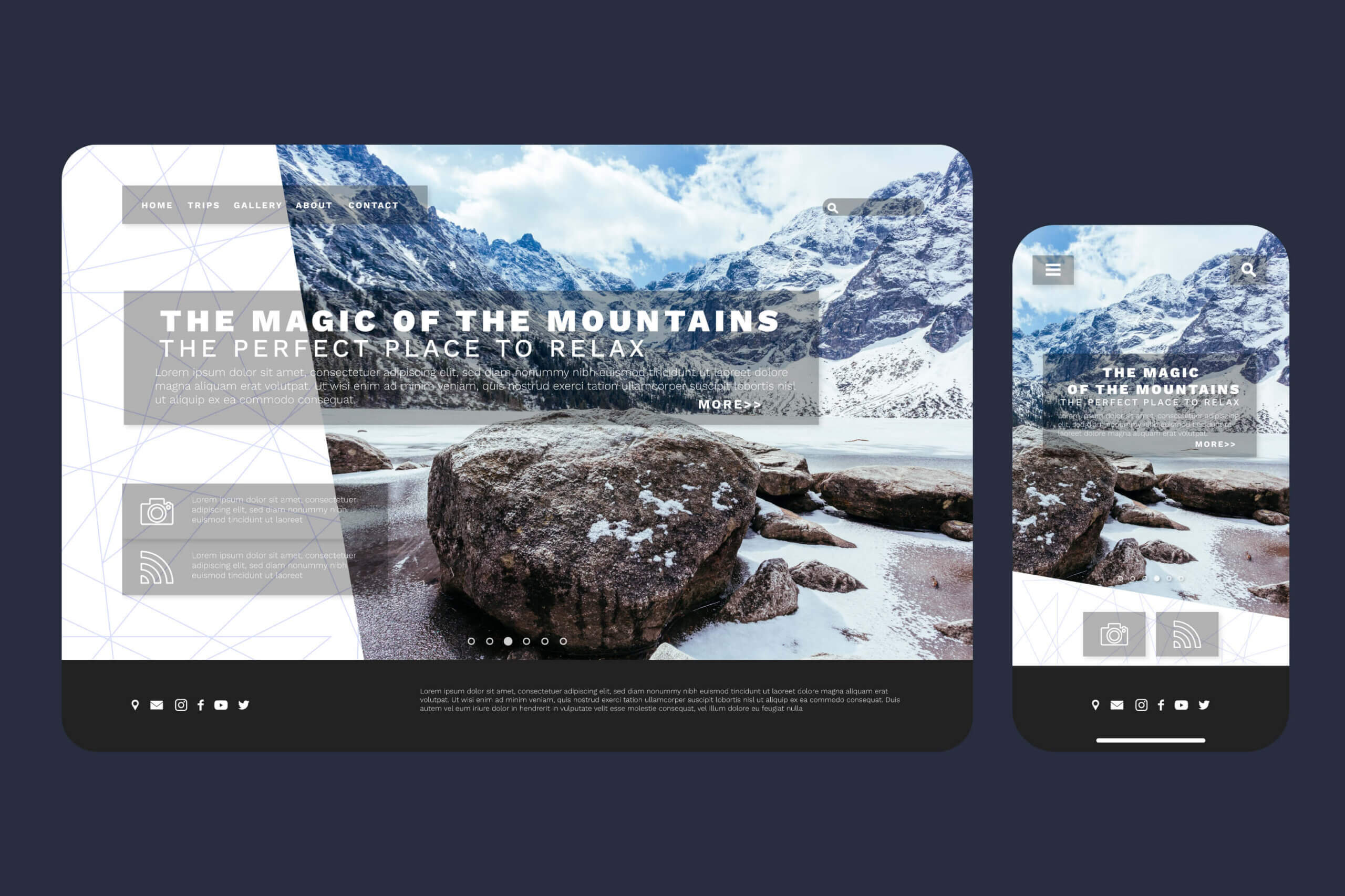
Why is this such an important issue from the users' point of view? If they find browsing uncomfortable, unintuitive or inconvenient, they may simply give up and close the site. But will they come back to our offer later, or will they open a competing website in the meantime and, thanks to its responsiveness, take action - register an account, order or purchase? What can we do to avoid such situations and not lose valuable conversions, and how do we design websites and seamlessly adapt the resolution to the device screen?
What is a responsive website and what is its configuration and SEO optimisation?

In order to create a responsive website, you need to use the RWD technique - Responsive Web Design. During the design process, the use of the CSS language is required, allowing the flexible adaptation of the website's components to different resolutions. Optimisation for pages adapted for display on different screens must therefore take into account the graphical and textual layout, all images, illustrations and fonts. With CSS, the entire site can be scaled precisely, adapting the size and width of the page to the requirements of each monitor or display. And it is precisely this scaling, which is oriented to screen resolution, that makes the content convenient and quick to access, which is the answer to the user's basic needs.

Twisting, zooming, zooming, panning - these mostly annoying actions can be avoided if you design a responsive RWD website that makes it easier to navigate and travel around your website. Thus, the correct use of HTML and CSS enables the responsive design that users expect and which will have a direct impact on the popularity of the website and its positioning in search engines. For internet users on mobile devices, a website that looks to scale when loading and looks good on both computers and smartphones is one of the most important factors in building loyalty, invaluable in the current reality of a highly saturated and competitive market.
Mobile vs. responsive website - mobile versions of websites and the principles of RWD website design and the differences between the two.

As if by the way, by introducing responsive web design, you also gain the absence of so-called duplicate content - if a website has two variants, it may be less well evaluated by search engine algorithms and result in weaker positioning. Sometimes websites that have a mobile version may be interpreted by Google's algorithm as sites with copied content, and as a result will lose quality in its evaluation.
Thanks to the changes brought about by the responsive design of a website for any device, the so-called 'responsive web design' is also decreasing. bounce rate, or rejection rate, one of the key ones used in analytics activities, which in a way determines the value of a website and its effectiveness. One interaction per session - perhaps this has hitherto been the affliction of a poorly configured website that was not user-friendly and only worked properly in the desktop version?
Many people who access the Internet on smartphones expect the content to be displayed correctly on them, the layout to be clear and the navigation intuitive. Responsive design does not only mean adapting to different screen sizes and resolutions, but also improving the loading speed of the website. All in all, then, such a version, created according to the principles of responsive web design, functions much more efficiently in all respects than dedicated pages for mobile devices.
Significantly improved search engine rankings and adaptation to display on different devices are the main benefits of responsive design, while it can be said with conviction that in most cases it is simply a a must have, to make it user-friendly. The increasing number of smartphone models with screens of different sizes and resolutions makes it impossible to create a mobile version of the site for each individual device.

RWD allows it to be perfectly customised so that a potential online shopper doesn't run away if, for example, the graphics displayed are too small or the site requires tedious scrolling down or side-scrolling. It goes without saying that users will not want to return to such sites, so the potential loss of reach and conversion goes much further than just the first unsuccessful visit. At this point, it is also worth clarifying the fundamental differences that exist between the terms mobile and responsive website. Those that are prepared for smartphones and tablets come with a prefix in the form of the letter „m” next to the domain name and are actually a specially developed, separately designed mobile version.
Is having a responsive website a must and how is it better than a mobile website?

Creating a responsive website sometimes requires only minor changes to the source code, which is also a huge advantage over designing mobile variants from scratch. The consistent look and feel, concerning the same page elements, animations and graphics, text fonts or product images that having a responsive website provides, repays the user with much more confidence - they can, for example, continue browsing on the move or at their leisure, without access to a computer, but with a smartphone in hand. The move to RWD technology can be likened to a change in the way television broadcasts are transmitted.

Who today remembers the tedious task of positioning analogue aerials according to the position of the transmitters or buying separate types for the reception of different programmes, as well as installing them and directing them precisely on the masts? The same is true for the creation of responsive websites - one universal and compatible solution for all, with no fine-tuning or combinations depending on the browsing method. All the additional benefits come by themselves - fast-loading pages, enhanced, for example, with AMP functionality, i.e. Accelerated Mobile Pages, increasing conversions and decreasing rejection rates, as well as noticeably better positioning. If a website is not responsive, Google's search engine will treat it with neglect.
It should be noted here that responsiveness has a direct impact on search engine positioning, and this is also due to the fact that applying responsive web design principles affects SEO. Since Google introduced Mobile-First Inedxing, i.e. indexing for RWD pages, providing them with higher rankings in search results, there has been a marked change in approach to page design.

Equally important is UX, i.e. user experience, a high quality indicator of which is also important when assessing the value of websites - it is when a website is responsive that we are promoted by the algorithm and thus directly translated into higher positions in the browser. Correct and effective optimisation can be monitored with the help of the Google Search Console tool, which will suggest changes and indicate where improvements are required, for example when content extends beyond the screen or some elements are positioned too closely together.
How does responsive web design affect the browsing experience on mobile devices?

Responsive Web Design is a method that is firstly much more versatile, secondly less expensive, thirdly less complicated and fourthly faster in operation. Four aces in the deck is enough to guarantee success, while configuring for different screen sizes is future-proof and simply essential in many cases. For example, when the mobile version of a website is opened on a desktop PC, the unusual resolution and design may confuse less experienced users if they do not see the letter „m” in the URL in time. Would they then be disappointed to hit the close button and not interact at all?

To eliminate this phenomenon, trust the services of reputable interactive agencies, for example www.nicesoft.pl, The responsive approach not only optimises the appearance of the website itself, modernises its design and gives it an individual character, but, thanks to the experience and knowledge of specialists, makes it a sensational business card for your company, regardless of the device. How does responsiveness affect SEO? To a large extent, when a new version of the website is created, many things can be improved and modernised on the occasion, and one of the many advantages of RWD is the ergonomic layout, which adapts to changes in the size of elements depending on the width of the screen - individual segments and sections, i.e. columns and blocks, are saved in percentage units, so they smoothly change their appearance according to the parameters of the device.
Using block layouts when creating websites boils down to designing content by arranging elements in proportion to the size of tablet or smartphone displays, modified according to their characteristics, such as screen width, orientation or resolution. This is linked to the use of the so-called "block layout". media queries, which allows flexible adaptation of the website, with which CSS rules can be defined and applied when certain conditions are met.
Responsive websites - who needs a website using responsive design for success?

Finally, of course, the financial dilemmas - is the price of designing and implementing a responsive website reflected in its true value? It's hard to come up with any other answer than „three yeses!”, and the reasoning is quite obvious. Firstly, moving to RWD technology is a small cost in relation to the long-term benefits of having it. Secondly, the number of smartphone users actively using online shops and browsing their favourite places on the web is steadily increasing, and there is nothing that condemns this trend to be reversed. Thirdly, when implementing Responsive Web Design, we will in fact be doing a general overhaul of an outdated and slow website that is out of step with modern realities and the demands of internet users.
In a virtual world that is dynamic and filled with competition, falling behind is not a good idea, as it can sometimes be difficult to catch up with fleeing rivals or re-earn the trust of a large customer base. Everyone who uses the Internet wants everything to work in the blink of an eye and almost anticipate the user's intentions, so upgrading the company website to different display sizes or improving the online shop with a switch to responsive solutions is really a requirement of today's times that there is no point in delaying.
